Brilliant copywriting and craft won TRY the Print Grand Prix at the Epica Awards for its sublimely simple IKEA campaign. TRY was also Agency of the Year. We chatted to creatives Caroline Riis and Eirik Sørensen.

Sometimes a single line is all you need. That was certainly the case for Norwegian agency TRY, which used compelling one-line stories to link two different IKEA objects. Originally conceived as a film, it was the print version of the campaign that caught the eye of a jury of journalists.
Creatives Caroline Riis and Eirik Sørensen have been working with IKEA since 2019. From the very beginning, Caroline says, they skewed towards “brutally honest advertising”. You may remember “The Trash Collection”, which rescued IKEA items abandoned on scrap heaps to send a sustainability message. Or the subsequent “Life Is Not An IKEA Catalogue”, depicting furniture afflicted by the grubby reality of everyday life. Executions included the titles “Puke” and “Pee”.
This approach evolved into the new tagline, unique to Norway, IKEA – Made For Life. Caroline says: “It’s a way of honouring IKEA’s concept of democratic design. Everything should be affordable and functional.”
The award-winning campaign launched Made For Life while answering the client’s brief of focusing on kitchens and food. “IKEA is not just about aspirational design; it’s made for the everyday. So it’s very believable that you can base true, honest stories on the premise of IKEA being a part of your life.”
From objects to stories
At first the team discussed the messy reality of kitchens, but other brands had been down that route before. So instead they began talking about their own IKEA kitchen items. Which is when Caroline had a corker of an insight.
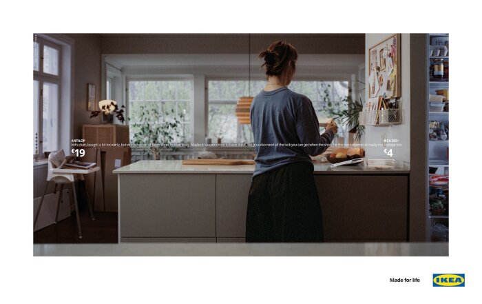
“I told Eirik the story of how, when I chose to freeze some of my eggs, I had to keep the the fertility shots in the fridge, because they had to stay cool. So I bought a little IKEA storage box and kept them in there. So I bought a little IKEA storage box and kept them in there. And then the ball started rolling in terms of, ‘OK, we can actually tell emotional stories here just by pointing to products people have in their kitchens.’”
They didn’t do an official focus group – talking to people in the office about their own experiences, or those of friends and relatives, was more than enough. In the end they had a list of about 40 ideas on the wall. “We asked ourselves which ones resonated the most – and we got loads of people from the agency in to give an opinion too. ‘Which ones feel honest and which feel forced or kind of gimmicky?’ So we ended up whittling the list down from 40-plus to four for film and three for print.”
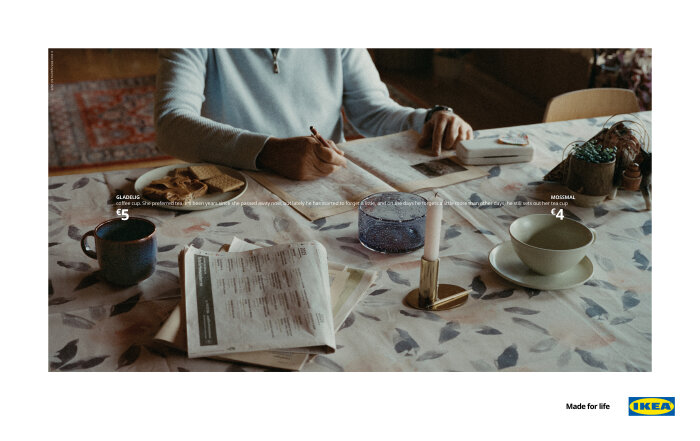
See the high-resolution versions, with the all-important copy lines, on our results page here.
Scandinavian realism
Although this Print Grand Prix winner was a film brief, Caroline admits that both creatives are fans of print. “We love how it’s so pure and direct. We knew IKEA would be okay with a print version, so we did whatever we could to make sure it would be a great print campaign too.”
The atmosphere and design of the images are integral to the campaign’s impact. Caroline says she and Eirik had a visual style in mind early on. “Eirik came up with the idea of the story growing out of IKEA’s famous price point, so we had the graphic element already. Then we wanted the look and feel of Scandinavian realism, without being inauthentic.”
They worked with production company Bacon and director Jacob Marky. “We’ve worked with him several times, so we knew he’d have the ability to get what we had in our heads onto film.”
They shot on analogue film, resulting in a faintly grainy, nostalgic aura. And of course the kitchens and living rooms are in real people’s homes. “We ended up using a lot of the objects they already owned, with a few adjustments like putting stuff in the fridge and making sure everything was in the right place.”
We sat on set literally trying out the lines, shaving a word off to make them fit.
Made you look
They shot on analogue film, resulting in a faintly grainy, nostalgic aura. And of course the kitchens and living rooms are in real people’s homes. “We ended up using a lot of the objects they already owned, with a few adjustments like putting stuff in the fridge and making sure everything was in the right place.”
The film’s director of photography, Benjamin Loeb, was also the print campaign’s photographer. “There were so many technical, complicated little things you had to keep in mind. Like the distance between the products. Because on film they were panning across the room – it was one take. So the text had to be exactly the right length, you couldn’t fake it. We sat on set literally trying out the lines, shaving a word off to make them fit.”
Caroline says the constraint was part of the fun. “As a writer it was great to have that kind of straitjacket, if you will. The design and creative writing were just so hand in hand.”
Interestingly, when the agency placed the campaign on a digital billboard, it was left static, like a classic print ad. You had to lean in, to concentrate. For the same reason, the film didn’t have a voiceover. “We thought that, okay, maybe only 60 per cent of the people watching will pay attention. But those people will really be paying attention.”
The stories themselves range from dark to humorous, which was a deliberate choice. “Even though I love going really punchy, we didn’t want the whole campaign to be a downer. We needed the kind of humour that made it bounce back a bit. So you have that bolognese bowl upside down, which is drawn from Eirik having three small children.”
Not that IKEA shies away from risk. “They keep surprising me with their bravery,” Caroline agrees. “I mean, when we proposed picking up their furniture as trash on the streets and selling it again, we thought we had a struggle ahead of us. And they were like, ‘Cool, fine. We believe in you.’ So that trust has been there both ways from the start.”
For the Made For Life campaign, Caroline’s story of the injection shots in the box was the first idea the team pitched. “That’s brutally honest to put on TV. But they said, ‘Yeah, that’s true – go for it, it’s really good.’ It’s a privilege to work with clients like that.”